STORYBOARDS
Task 1: Make a one-time donation (min. RM3.50) for a community

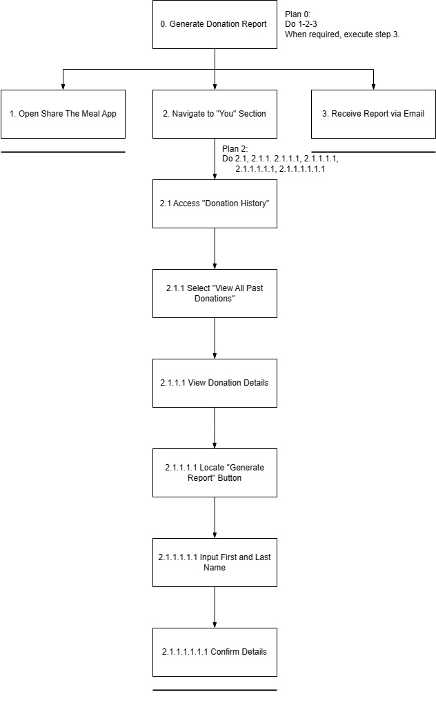
Task 2: Generate a report/details of the user's donation

Scene 2
The user sits in his office and decides to track his contribution to the society with ShareEats.
Scene 3
A close-up of the user's face shows determination and eagerness as he navigates through the app.
The screen displays a list of the user's past contributions, showcasing various donations made through the ShareEats app. The user is seen scrolling through the list, looking at the donation details with a thoughtful expression.
The user finds the "Generate Report" button and presses it.
Scene 6
The screen displays a progress indicator, symbolizing the app processing and compiling Jun Boon's donation history into a detailed report.
Scene 7
The screen displays the report.
Scene 8
The user smiles with satisfaction, feeling empowered by the app's user-friendly experience that aligns perfectly with his commitment.
Task 3: Set notification to update donation alerts and engagement reminders

Scene 1
As a compassionate AIESEC member in Sabah, Ze Min introduces the 'ShareEats' app to his fellow members, sharing his vision of using technology to amplify their collective impact on global issues such as poverty and hunger.
Navigating the 'ShareEats' app, Ze Min highlights the efficient "Reminders and notifications" feature to his AIESEC peers, explaining its potential to streamline their efforts in addressing charitable causes.
In a focused moment, Ze Min actively engages with the 'ShareEats' app, toggling both "Donation Alerts" and "Engagement Reminders," aligning the app with his commitment to staying informed and enhancing collective engagement.
As Ze Min continues his philanthropic work, notifications efficiently pop up on his phone, showcasing the seamless function of "Donation Alerts" and "Engagement Reminders" and keeping him and his fellow AIESEC members informed in real-time.
Scene 5
ALTERNATIVE DESIGN
Alternative Design 1 - JANE NG JING YING

Alternative Design 2 - KHAIRUNNISA BINTI ROSLAN

Alternative Design 3 - ONG JIA YU

Alternative Design 4 - SIOW XIN YA

Alternative Design 5 - TOO JUN XUN

VOTED DESIGN ELEMENTS/LAYOUTS

— JANE NG JING YING
— KHAIRUNNISA
— ONG JIA YU
— SIOW XIN YA
— TOO JUN XUNWIREFRAMES
Wireframes for Task 1 - Make a one-time donation (min. RM3.50) for a community

Rule 1 - Consistency
The interface maintains a consistent layout and visual style across donation screens. To ensure a consistent color scheme, typography, and button styles across all donation screens, we mainly apply a soft color scheme throughout the whole application interface design which is blue and light green. Besides, we used the same terminology and visual elements consistently. For instance, we always have the donation amount displayed prominently in a specific location.
The consistency ensures users can easily recognize and understand the donation process and enhances usability and user experience.
Rule 3 - Informative Feedback
During the donation process, the mobile application system will display real-time feedback. For example, a progress indicator and confirmation messages will be shown to users as they perform actions and also real-time feedback during the donation process. When users enter the donation amount, a dynamically updated total will shown. After confirming the donation, a confirmation message with details and perhaps a celebratory animation to acknowledge the contribution also will be shown. The informative feedback keeps users informed about the status of their donation at the same time reducing uncertainty and providing a positive experience.
Rule 8 - Reduce Short-Term Memory Load
To reduce the short-term memory load of users, before final confirmation, the interface will display a summary of the donation details which include the chosen amount and selected community. This ensures that users have a clear and immediate understanding of their contribution without relying on short-term memory. It also reduces short-term memory load and ensures users have a clear understanding of their donation details hence preventing confusion.
Wireframes for Task 2 - Generate a report/details of the user's donation

Task 2 implements Shneiderman’s Golden Rule and Gestalt Principles in the design to enhance the user experience while using the “SHARE EATS” application.
For Shneiderman’s Golden Rule:
Rule 3- Offers informative feedback.
This application will display feedback immediately to the user after they click the button to download the donation receipt. For example, when the user clicks the button, the page will turn into another page showing the progress where the receipt is generated. This informative feedback offers a sense of security to the user where they can ensure that the donation has been made successfully.
Rule 6 -Permits easy reversal of actions.
From the design, it can be seen that there is a return arrow on the left corner of each page where the user is carrying out a particular task. This arrow can make the user feel less anxious and more willing to explore the options since the user knows that there is an easy way to solve the problem by clicking the arrow button.
Rule 7- Supports internal locus of control.
This feature gives control and freedom to users so that they can feel that they are in control of the system themselves. Cite an example, in frame 1, the user can choose whether to generate the receipt or not. Not only that, in frame 3, the user can also choose to download the receipt in PDF version or not by clicking the download button at the right corner. By doing this, this application is giving freedom to the users and making them like they have control over what they will receive.
Wireframes for Task 3 - Set notification to update donation alerts and engagement reminders

Shneiderman's Golden Rule 1 - Consistency
Reminder and notification designs that are consistent improve user predictability, lessen uncertainty, and create a more seamless and joyful user experience. Toggle icons, for instance, allow users to turn on or off reminders that they are acquainted with and understand how to use. Additionally, as the color green denotes an impending event, it also indicates that the notice has already begun to function.
Shneiderman's Golden Rule 7 - Support internal locus of control
Reminder and notification functions allow users to change the settings according to their liking anytime. This feature allows for scheduling or preference modifications, making the experience more user-friendly. Users may manage their reminders and foster a sense of control better by implementing these features, which also lessens the possibility of dissatisfaction related to irreversible acts.
Shneiderman's Golden Rule 8 - Reduce Short-Term Memory Load
This design will alert the user by giving notifications and reminders regularly. In reminder and notification design, reducing short-term memory burden entails providing information in a simple and easily understandable manner. This approach seeks to reduce the cognitive effort required for users to grasp and act on the presented information. Users are more likely to remember details and take the necessary actions if notifications are clear and plain. The user can keep the content of notifications focused on key information and prioritize the most critical aspects.
INTERACTION METAPHORS
Metaphor 1 - Sliding feature

The sliding love button is designed to imitate a sliding window, where users can slide the heart-shaped object to decide the amount of donations. When users slide to the right, the amount of donations increases while sliding to the left will reduce the amount of donations. This feature allows users need not to input the amount of the donations by themselves. Besides, it eases the donation process.
Metaphor 2 - Color Psychology


Color is one of the most important and influential tools a designer has. Hence, we use colors that are soft and refreshing, which are green and light blue colors as the theme colors of our design. It is because soft colors are clearer to read and inspiring. Blue is calming, deep, mysterious, and clean and at the same time, green is a very down–to–earth color. It can represent new beginnings and growth. The combination of these colors will provide a good usage experience for the users.
Metaphor 3- Download icon

(Figure from Wireframe Task 2)
This download button acts like pressing a physical button to activate a mechanism. When a user clicks this button, it will initiate the retrieval of digital content. This metaphor aligns with the concept of taking an intentional action to obtain something, which is a common and intuitive interaction in digital environments.
Metaphor 4- Receipt Metaphor

This interface is like a real deposit receipt that a donor will receive after a donation is made.It provides a customizable receipt design to enhance the personal touch. Users may have the option to customize the appearance of their digital receipt later on. They can choose colors, add emojis, or even include a personalized thank-you message to make the experience more intimate.
Metaphor 5- Notification icon